
Arlo| Finance Application | UX Design


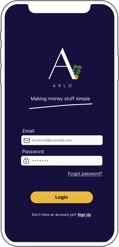
Arlo
Making money stuff simple.
Arlo is a responsive web application that allows users to send, receive and transfer money to anybody, anywhere, in addition to helping users save and budget their money easily.
The aim of the application is to "make money stuff simple" for users who may not have / had much financial education or knowledge so far, or who struggle to understand the finance jargon that sometimes comes with finance applications and websites.
Date | 2022 - 2023
Role | UX Designer & Researcher
Tools | Figma
Deliverables | Competition Analysis, User personas, User interviews, User flows, Wireframes, Prototypes, Design Style Guide, Prototype
Design Process
Discovery
Competitive Analysis
User Research
User Interviews

Define
User Personas
Mental Models
Information Architecture

Wireframes
Prototype
Style Guides

Design
User Testing
Updated prototype

Refine
The Problem Statement
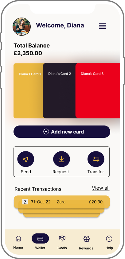
Users need a way to manage their finances efficiently, easily and securely, as well as have a "all-in-one" view of their accounts, balances and cards. They will need an intuitive platform that makes juggling multiple funds and transactions simple.
We will know this to be true when we see users using the app to manage their transactions and finances, and see a high retention rate of users continuing to use the product and services.
Competitor Analysis
A complete competitive UX analysis was performed on two existing payment platforms - PayPal and Google Pay - reviewing the key objectives of each brand, their overall strategy, their market advantage and a full SWOT analysis.
Overview
Strong brand position of “safer, easier way to pay”
Mature brand, with dominance in the market
Large service offering & consumer trust
Well designed, clean and slick interface
Overview
Advantage of Google brand name
Affiliation with Google comes with high value brand name which already has a huge user base
Integrated with all major banks & mobile providers
SWOT Analysis
Strengths
Global presence
HUGE user base (325m+ in 202 countries)
Brand recognition
Consumer trust
Integration with millions of well known brands
Weaknesses
High transaction fees
Open to fraud
Users need to be connected to the internet in order to successfully complete transactions
Opportunities
Tech advancements. They could use these to their advantage to further improve their product and service offering.
Further global expansion. PayPal are already in a lot of markets across the globe... however, they're not in all of them! Opportunities to expand into other countries or currencies.
Loyalty & Rewards program for customers
Threats
Competition. It's a growing market with competitors such as Google Pay and Klarna now offering similar services.
Technology advancements. Contactless payments is one example of something that didn't exist when PayPal first launched and while it has done well so far, keeping up with further tech advancements could prove tricky and costly for such a big business!
Google brand name is highly valuable and recognised.
Accepted at millions of in-store and online retailers
Works with hundreds of banks and payment providers and supports all card types.
Available in 28 countries
Strengths
Weaknesses
Sending & requesting money is only available to US users
Ability to pay in store is only available to Android users
Users need to be connected to the internet in order to successfully complete transactions
Opportunities
Tech advancements. They could use tech advancements to their advantage to further improve their product and service offering.
iPhone compatibility - this would open up a huge new potential user base
Expand send & request money functionality to all customers
Loyalty & rewards program for customers
Threats
Competition. It's a growing market and Google have competitors that are more established and mature - e.g., PayPal - with mobile and online payments being PayPal's speciality and core function of the business. Google have lots of other offerings that take time and resource away from their Google Pay business.
PayPal UX Analysis
After completing the UX analysis of competitors, a Business Requirements Document was written, in order to identify the business requirements that the project needed to fulfil, as well as identify the key stakeholders, any risk involved in the project, as well as the scope, functional requirements of the app and an initial delivery schedule.
User Interviews & Research
Next came arguably one of the most important parts of the process: User Research.
I conducted user interviews with three participants from my personal network in order to further my understanding of user needs and current pain points with existing applications.
***********
Research goals
To identify and explore what features and functionality user's expect from an e-wallet app and why those are important.
To determine any pain points users have experienced with existing products either currently or in the past.
To determine what level of knowledge users have around managing finances and budgeting, and what knowledge they feel would help them feel more empowered when it comes to managing their finances.
The Participants
The
Interview
Questions
1 | Which features or functionality would you like to see in an e-wallet application that you don't currently have access to?
2 | In what environment - or where - do you most use e-wallet applications? (E.g, at home, at work, out shopping etc)
3 | Please could you tell me a little bit about your current knowledge around finances and managing your money? Do you feel confident managing your own money? Do you know how to budget?
4 | What do you currently use - either on or offline - in order to help you manage your money and budget on a monthly, weekly, or daily basis?
5 | What are your current finance / money goals?
6 | Is there anything surrounding finance / budgeting / money that you wish you had more knowledge about? If so, where would you typically go to find this out?
7 | What would help you to feel more confident when it comes to managing your personal finances / money / budget?
Affinity Mapping & Insights
Once the user interviews were completed, I analysed the results into actionable user needs and pain points by creating an affinity map of user quotes, categorising them into four key segments, and then extracting the key insights from each below.
Click into each image below to enlarge
Key Insights 👇
Personal Finance
Users have bank accounts with multiple different providers, meaning that they have to constantly login to different apps. Users, therefore, want to be able to see at a glance what their overall financial position is quickly and easily.
Convenience
Users value convenience and something that makes their lives easier - whether that's by making a process faster, more efficient, or meaning they don't have to carry round as much stuff! They need an app that will integrate seamlessly into their current schedules, not cause disruption or require them to do anything extra.
Education
Not many users have ever been formally taught how to budget or manage their finances, and all would like to gain more knowledge on this topic, but in a way - and language - that would be easily digestible, accessible and understandable.
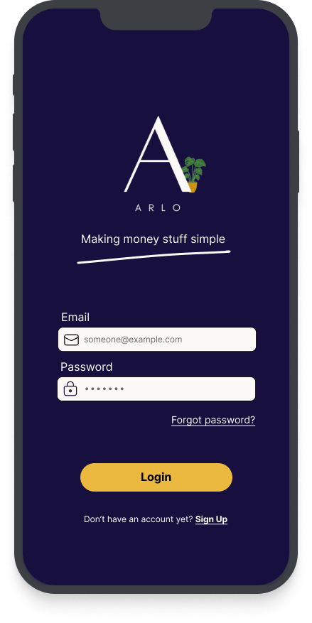
Security
Users need to feel confident that both their finances and personal information is safe and secure. Therefore, a solid, secure - but quick and easy - login flow is essential for users to trust the app and use it.
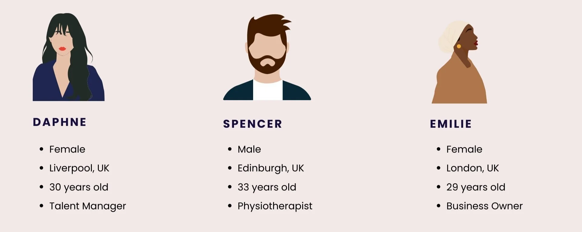
User Personas
Once the user interviews and analysis had been completed, I was able to create two distinct user personas - informed by the research - that represented two difference audience groups.
Click each image below to enlarge
Mental Models
Following the user personas, I was then able to expand this by not only thinking about who each persona represents, but what they might think, feel and do while completing some primary tasks of the application. All of which helped me to brainstorm further ideas for functionality and user flows that would help users achieve their goals quicker and easier.
Click each image below to enlarge
Information Architecture
Next up, was creating a sitemap using IA frameworks and principles. After an initial sitemap was created, I then recruited seven participants to complete a closed card sort to validate my original hypothesis of information categorisation.
As a result of this, I was able to improve the IA to be more intuitive to the users expectations, as well as rename a few page names to be clearer and communicate what they do, better.
The Site Map -
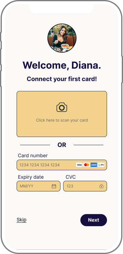
Initial Wireframing & Prototyping
Low-fi Wireframes
It was then time to put pen to paper and design some wireframes!
My very first wireframes and prototype were created using good old fashioned pen and paper, that allowed me to design and iterate more freely before transferring to a digital version using Figma.
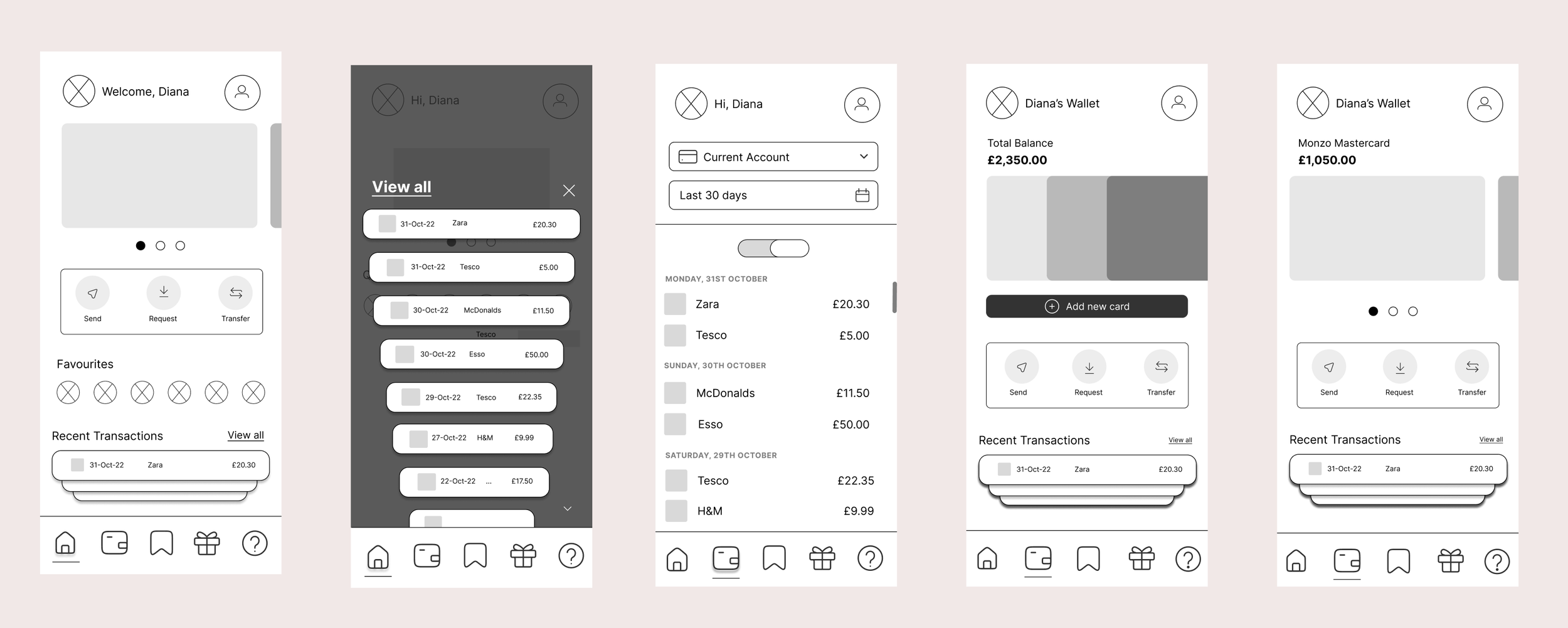
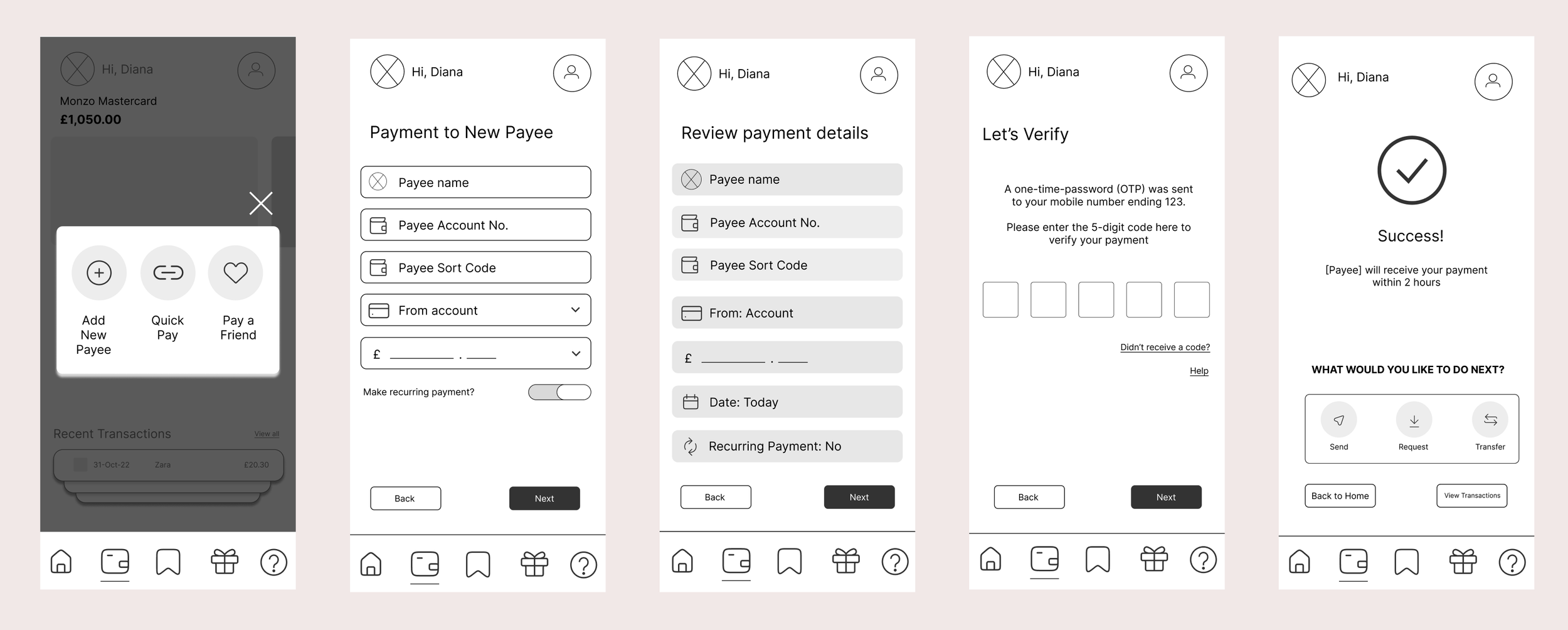
The three main flows that I wanted to wireframe were for -
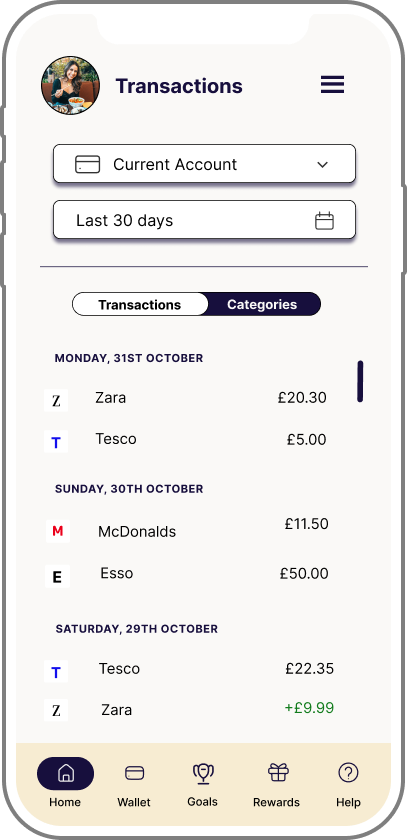
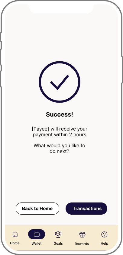
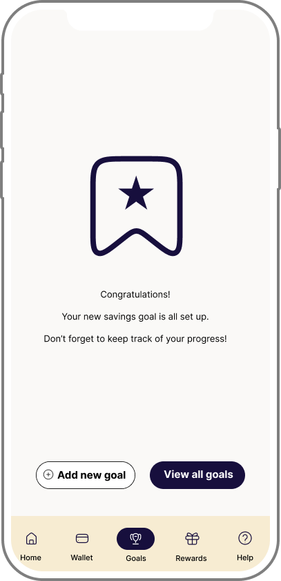
User viewing transactions
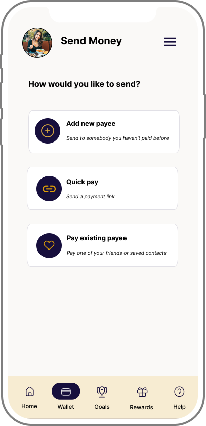
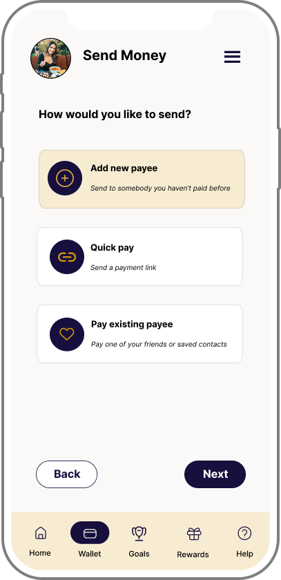
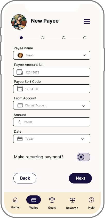
User sending money to a new payee
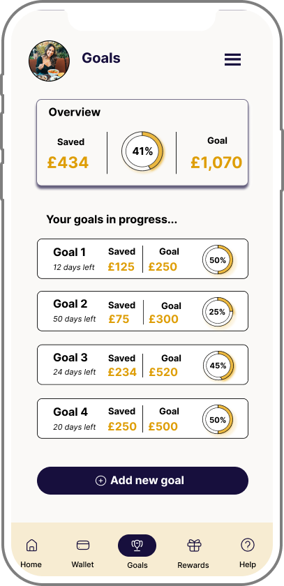
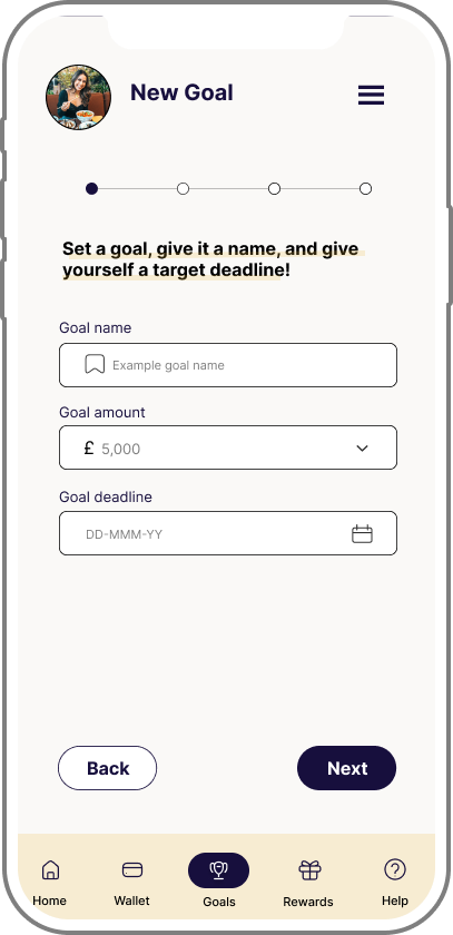
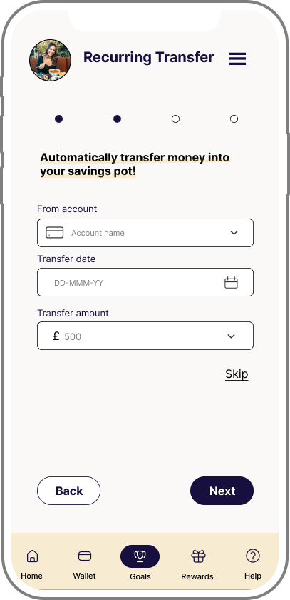
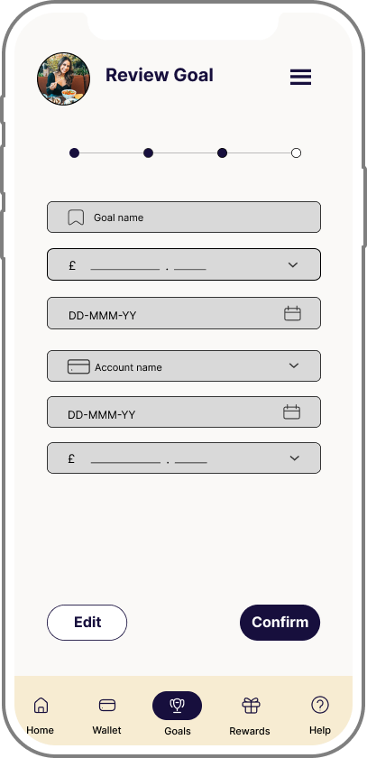
User creating a new savings goal
Viewing transactions
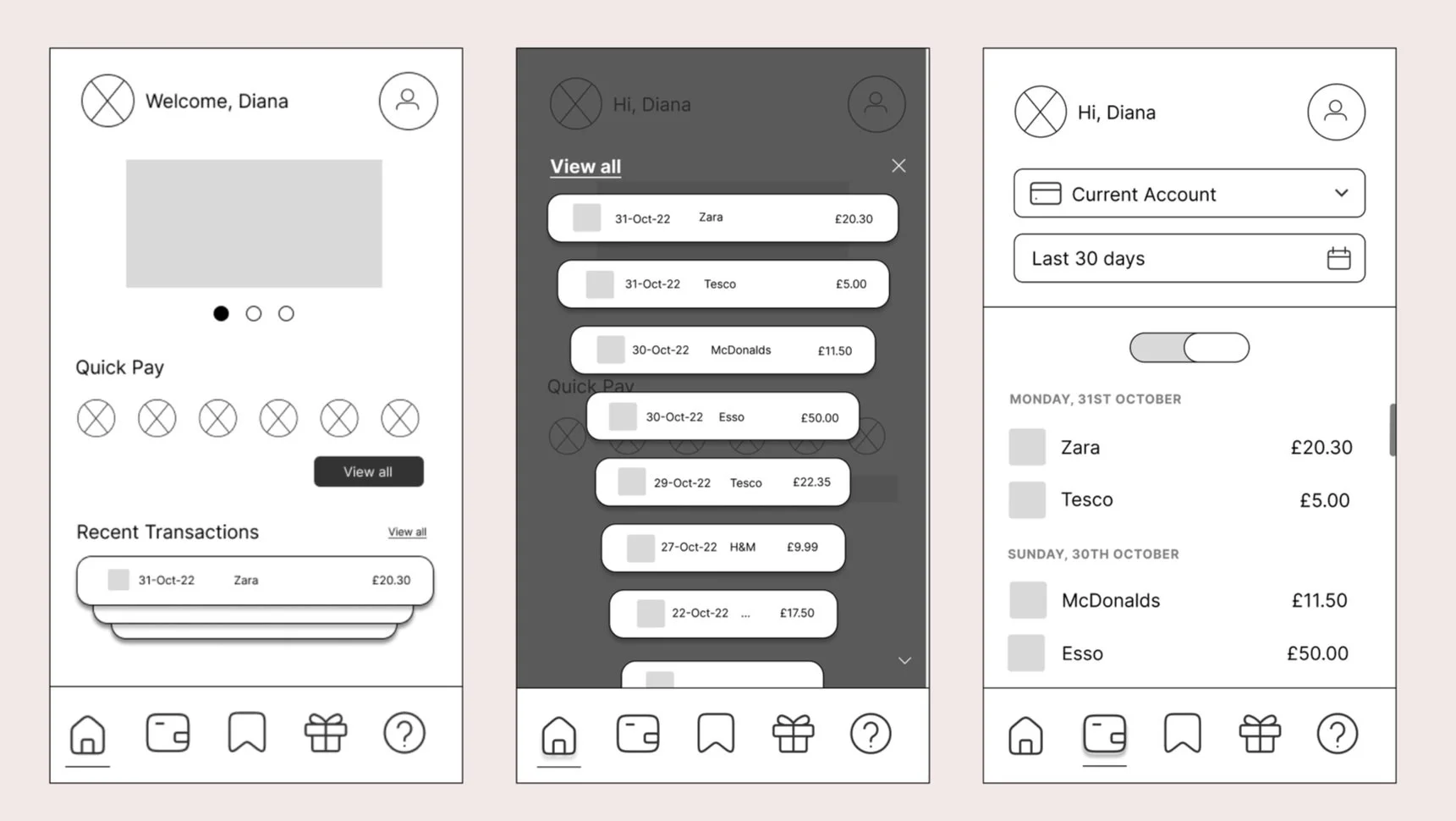
2. Paying a new payee
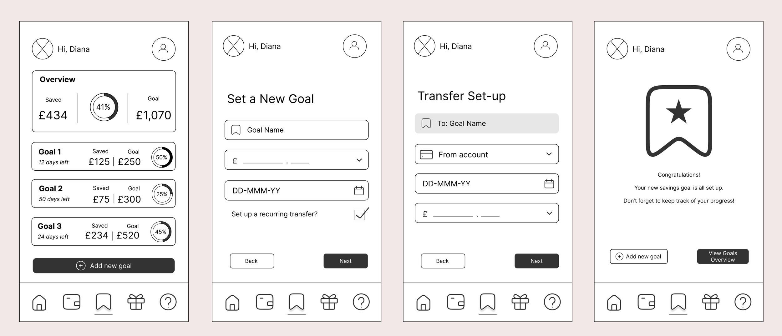
3. Setting a new savings goal
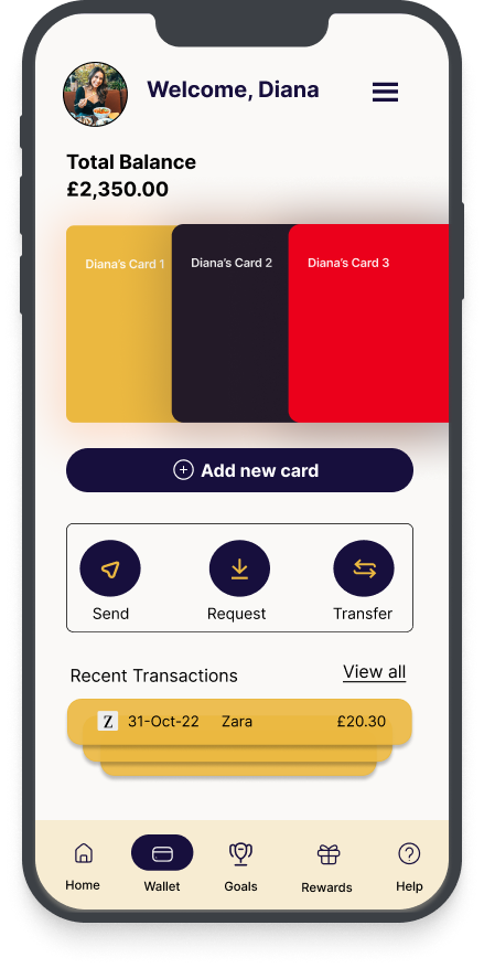
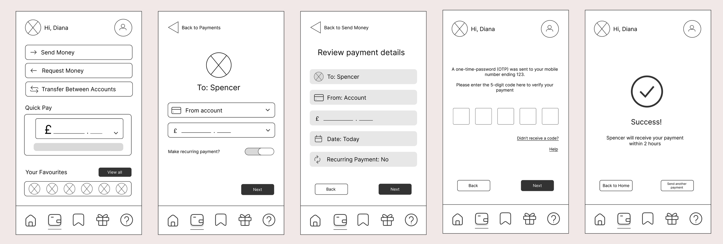
Mid-fi Wireframes & Prototype
Following the low-fi wireframes and some rapid prototyping, it was then time to add a little bit more detail to the prototype in order to get it ready for user testing.
Here are the mid-fi wireframes for each of the same three user flows.
Viewing transactions
2. Paying a new payee
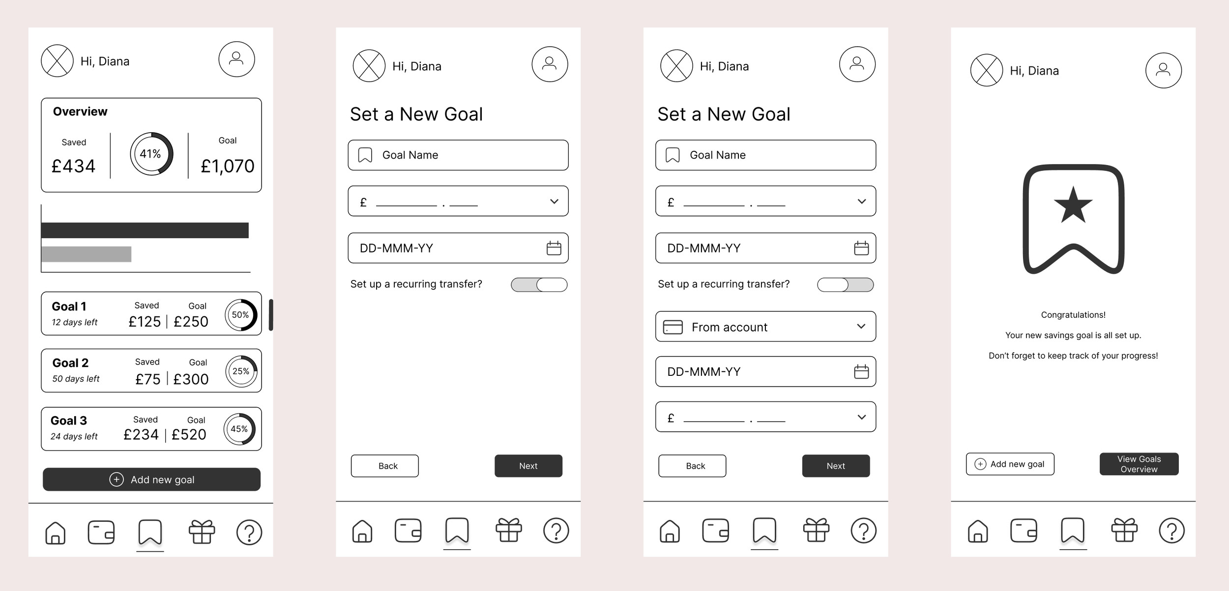
3. Setting a new goal
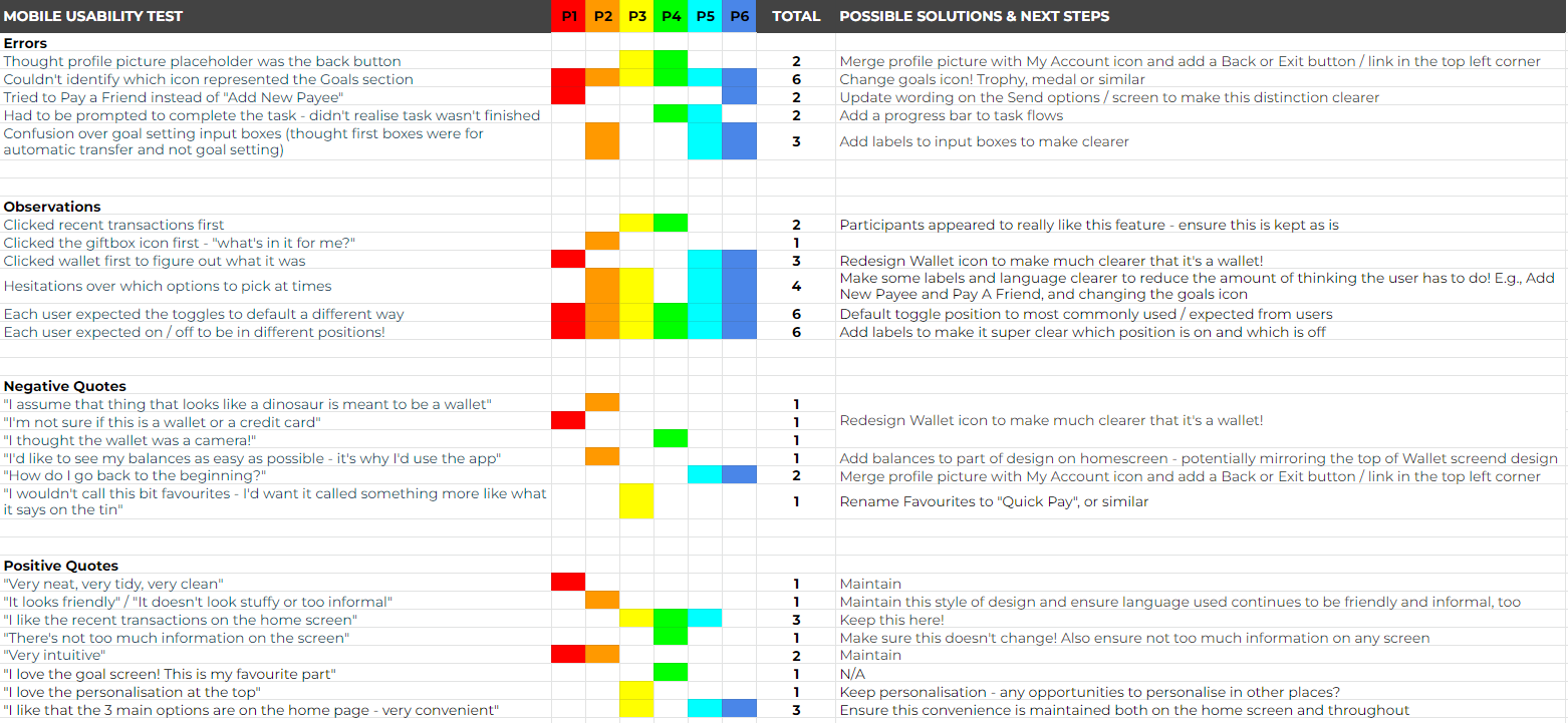
Usability Testing
I conducted remote moderated usability tests with six participants, with the aim of assessing the learnability for new users interacting with the app, and how easily prospective users can navigate the app and use its core features.
For the full Usability Test Plan and Usability Test Script, click the buttons below!
The Test Results
Based on the feedback and observations from the participants, I created an Affinity Map and also completed the Rainbow Spreadsheet, in order to categorise and analyse the results, and the prioritise the updates and amendments required to the application and user flows.
It was clear that the most important usability errors that needed to be fixed related to some of the navigational icons, the toggle switches and the language used on particular labels to ensure it is crystal clear to the user what each button or option is for.
Click the image below to view the full document in Google Sheets.
Further Feedback & Design Iterations
In addition to implementing feedback from the user testing above, I was also able to significantly improve my designs through the following…
Grids & spacing fundamentals: A five-column grid framework was added to all of my creens, and spacing of all elements updated to follow the grid and improve the design and alignment.
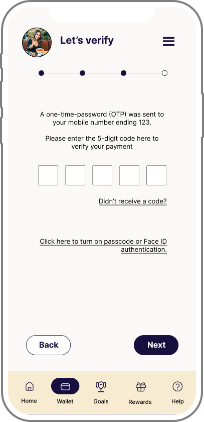
Peer feedback: I collaborated with CareerFoundry peers in order to get their insights, thoughts and opinions on how my designs could be improved. This resulted in ensuring text sizes were consistent and all text was in sentence case, offering the user an alternative to using the OTP flow each time (directing them to turn on Face ID in settings, for example), adding labels to toggles to make clearer and a complete redesign of one of the screens which, I completely agreed, it so desperately needed.
Designing for accessibility: Following usability techniques and principles, I updated my designs so that input fields had fixed labels that didn’t disappear when the user started typing, adding of easily identifiable icons, and improving the contrast of colours and text to meet the AAA standard.
Below are some examples showcasing just how my designs have been iterated and improved throughout the process
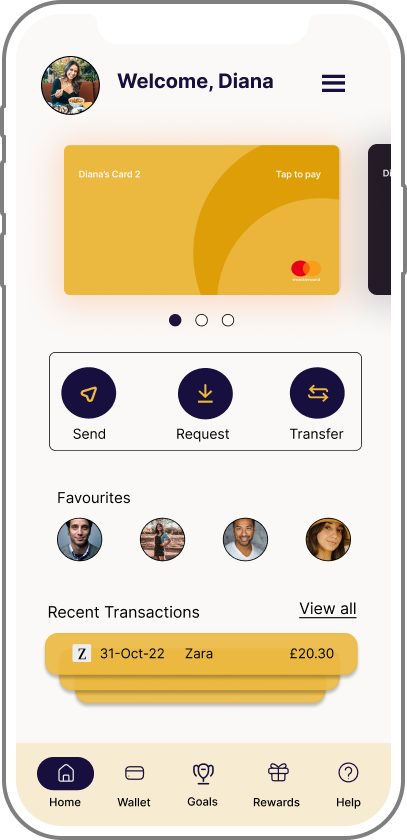
HOME SCREEN
SEND MONEY SCREEN
LOGIN / SIGN UP SCREEN
GOALS OVERVIEW SCREEN
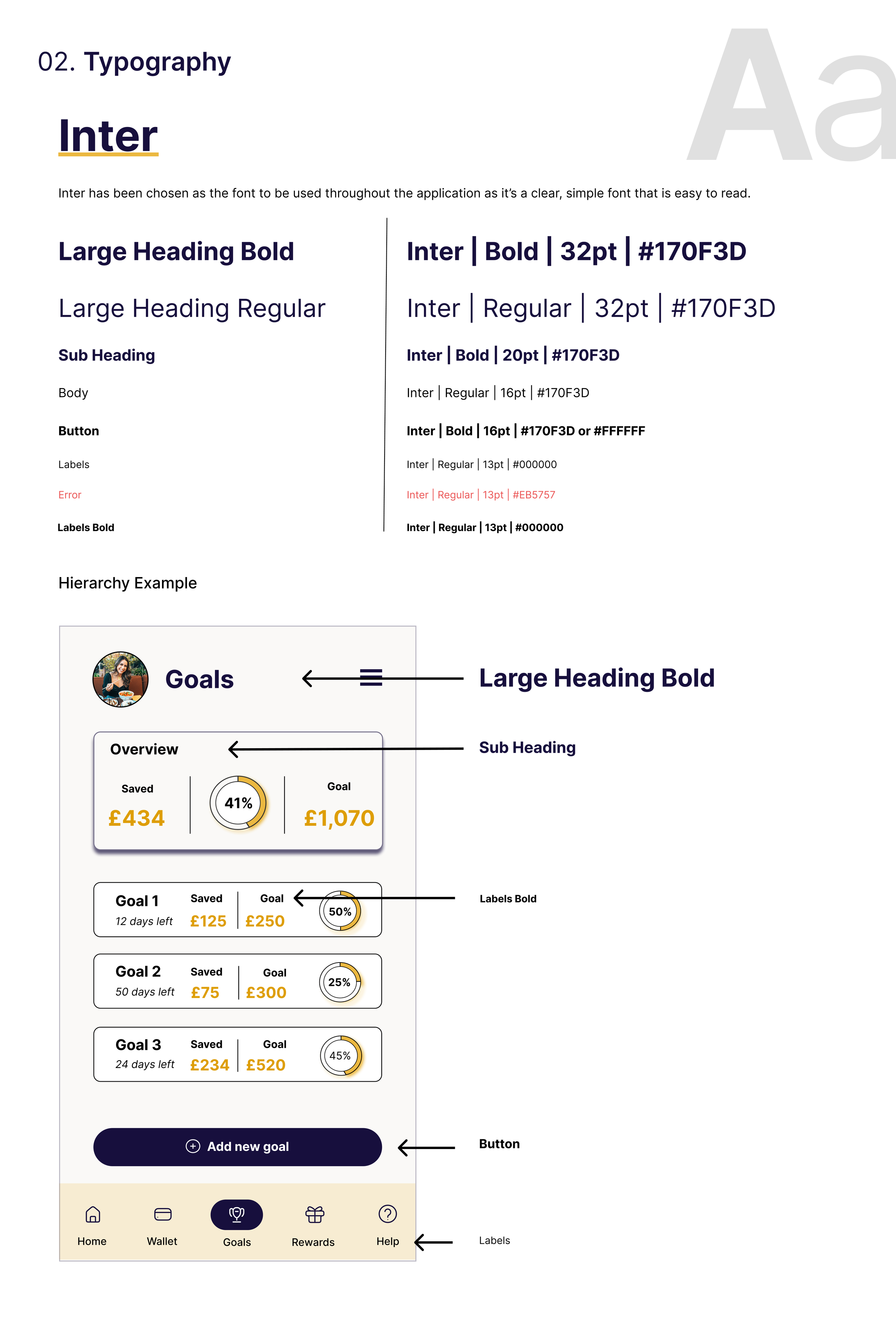
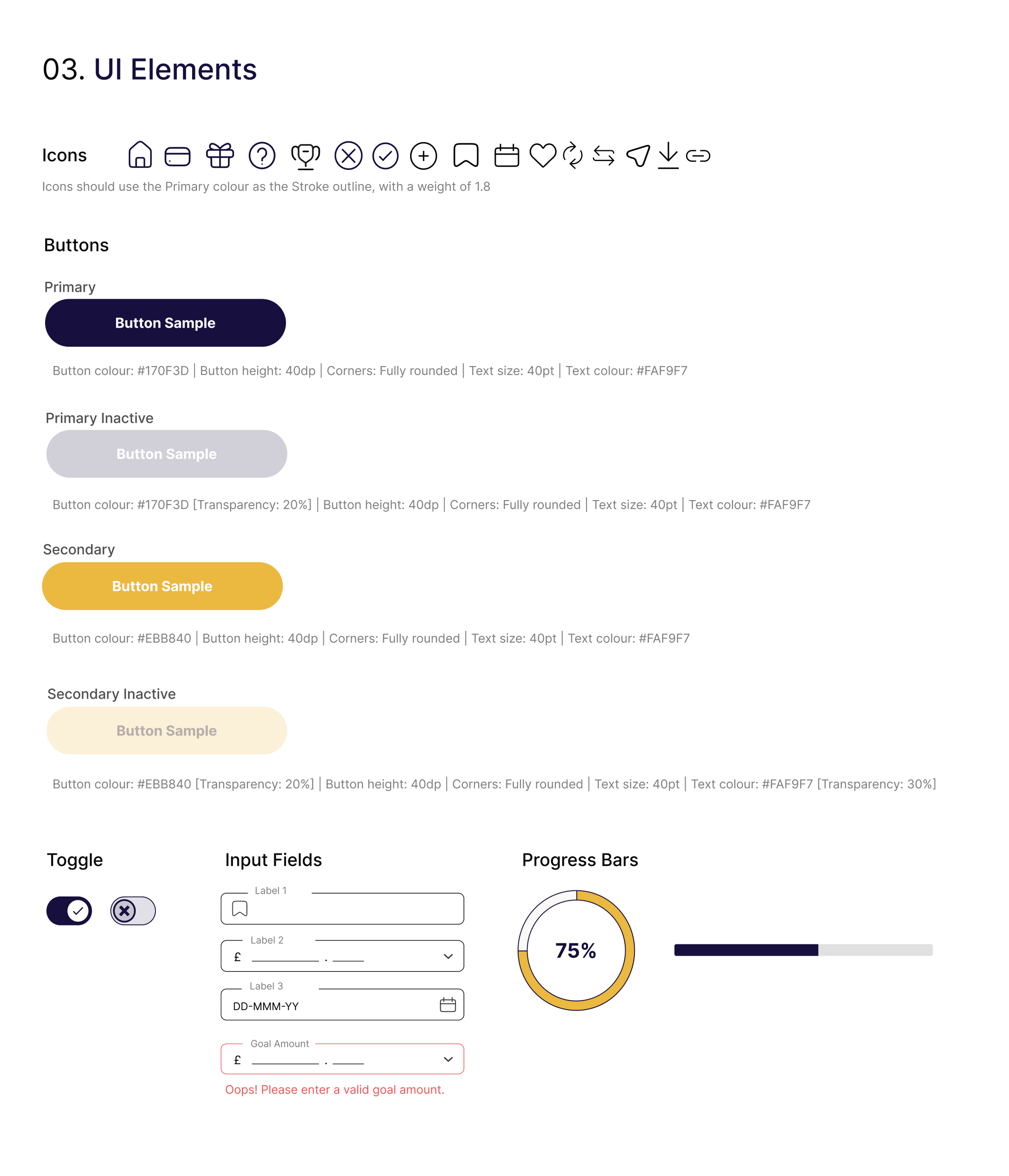
Design Language System
Following the usability testing, peer feedback and further iterations, one of the final parts of the project was getting the design ready for handoff to developers.
As part of this, I created a full set of design style guidelines, extracts of which you can see here
I was sure to incorporate colour, typography and UI guidelines, including inactive and error states.
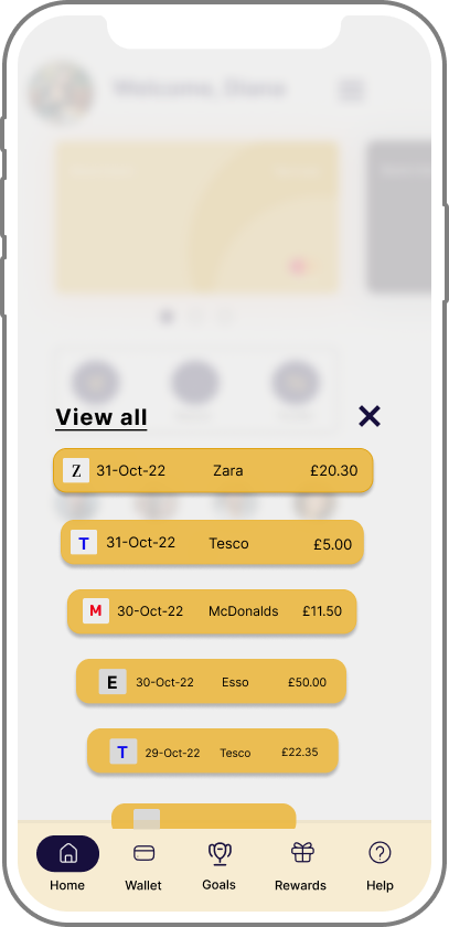
The Final Design


Conclusion & Reflection
Working on this project has been challenging, rewarding, exciting and, when one of your closest friends says your first attempt at a wallet icon resembles more of a dinosaur than a serious payment method, hilariously therapeutic.
It’s truly shown me the importance of research and talking to your potential users before designing even the smallest part, and how critical it is to remember that you’re the designer, not the user.
Similarly, I’ve seen first hand how vital user testing is. As the designer, you know what each part of the application or icon or user flow should do, but getting fresh eyes on your design - who might not know what each part or icon or flow should do - to give honest feedback is just as essential to ensure that the design is as intuitive and easy to use as possible.
I never realised just quite how iterative the design process is until this project, and I’m hugely grateful for everything I’ve learned as I know that each lesson will absolutely benefit me in my future work.
One of my favourite parts was actually learning how to design for accessibility, as not only do I find this part of design super interesting to learn about, but I feel that it was at this point, that my designs truly formed and came together.
Finally, working on this project with CareerFoundry has completely changed my view to receiving feedback. I used to feel a little deflated whenever receiving feedback at work, thinking that it meant I wasn’t good enough at my job. Now, whenever I get feedback from my Tutor, I feel excited at the prospect of learning something new and improving my work even further.