
UI DESIGN | WEBSITE & APP DESIGN
Fitted
The below portfolio formed part of my UI Design Certification final coursework.
Fitted
A responsive web application for people who are new or returning to fitness, to enable users to search and view routines, exercises, guides, daily challenges and other information.
It allows users to personalise an exercise routine that suits them, their level and their schedule, while keeping exercise fun and keeping them motivated.
Date | April - May 2023
Role | UX / UI Designer

Goals
We wanted a way for users to:
Search and filter exercise videos
Schedule exercises
Option to add sessions to calendar
Create user accounts
A game layer with individual daily challenges, achievements and / or rewards
Social sharing for routines or favourite exercises

Click on the images below to expand
User Flows

Wireframes
The first step was creating was super quick, low-fi wireframes using a pen and paper, to let the ideas flow and get an idea of what the user flow above might look like on screens.
Then, using a grid system, I transferred these onto Figma to create the below digital low-fidelity wireframes for Fitted.
Then, after applying spacing fundamentals, visual hierarchy and some UI elements, my mid-fi wireframes looked like this -

Moodboards
As part of the branding and design process, I created two moodboards to demonstrate two potential colour schemes for the Fitted brand taking keywords from the brief and user persona.
Moodboard A
This moodboard is centred around the colour green, and has much more of an overall health and wellness feel to it.
Green symbolises health, growth, revitalisation but also relaxation.
Our key persona is Rebecca, who's a beginner to fitness and so I felt the calming effect of the green shades here would help somebody like Rebecca to feel welcomed into the fitness world, calm and at ease.
Rebecca also has a busy schedule and job, and so the calming effect of this colour would also help.
Some fitness apps use a real neon green paired with black, however I felt this comes across as quite intimidating and more suited to intense, professional gyms, and so while I wanted to incorporate green, I wanted to do so in a friendly, encouraging way.
Moodboard B
This moodboard is centred around the colour orange, has a bit more "energy" to it but still retains a lifestyle feel that still feels welcoming for a beginner.
Orange symbolises positivity, fun, warmth, enthusiasm and high energy, all of which are important aspects of health and fitness.
Rebecca wants to keep motivated with her fitness journey, and so this bright colour will really help. She also wants her fitness journey to be fun and informative and, again, orange really helps brighten the mood and give it a more fun feel.
Similar to green, some gym and fitness brands will use a real intense, neon orange paired with black, but I felt this also gives it a more masculine, intimidating feel, and so the shades used here - I feel - makes it more welcoming to people of all levels.
Moving forward
I found this decision to be really difficult, as I love both of the potential moodboards and, when talking to friends, there was a real split in preferences between the two.
In the end, I decided to move forward with Moodboard B, due to the following reasons -
The partial brand guidelines in the project brief mention oranges and blacks
It has a more motivational feel to it which helps when it comes to exercising
Moodboard A, I think, would be better suited to a more overall health and wellness focused app
It immediately feels bright and energetic, whereas the green board feels almost too-calming
It has a more fun vibe which is what our persona wants
The Style Guide
Once I’d decided on an overall brand theme using the moadboards above, I then designed a logo, honed in on the exact colours I wanted to use, the typography, icons and other UI Elements, to all come together in the style guide below.
Also included in the style guide are error instances, as well as guidelines for the types of images and photography that should be used in the application.

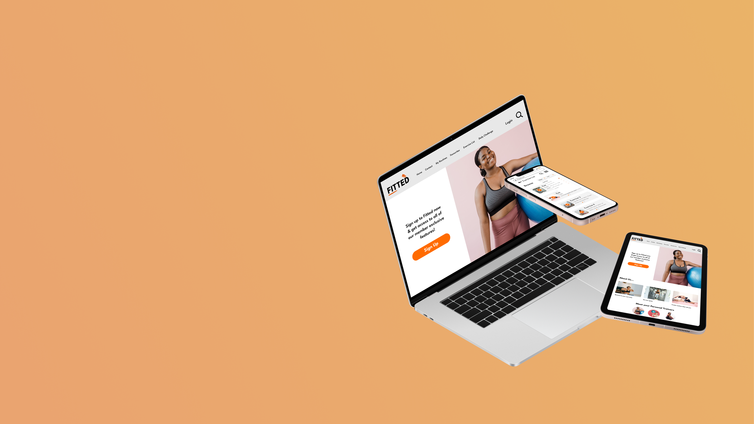
Responsive Design
One of the final tasks of the project was to implement standard grid systems in order to adapt my designs for multiple breakpoints, allowing the site to viewed on devices of any size.
Below, you can see examples of a couple of screens that have been adapted from mobile to tablet and desktop designs.


High-fi Wireframes & Mockups
Here, you’ll find the high-fidelity mobile wireframes, as well as the final mockups displaying the multiple breakpoint screens on multiple devices. These mockups would form part of presentations to stakeholders or clients.


Final Prototype
And finally, if you would like to have a play around on the interactive prototype of my Fitted app and view some of the animation that has also been added, simply hit the button below.
Enjoy!